Ostinato Port Stats UI improvements
Recently Ostinato user Ezra gave me some feedback about the Ostinato Port Stats UI -
I find it very unreadable when for every parameter there is Rx and bellow Tx.
I think it would be much clearer if all TX (byte, packets, whatever) will be on top and then all Rx (packets, byte, etc..) will be below.
I would order it as bellow. With the current order it is very difficult to see in a glance the parameter I am interested. I have to read all and even worse, the lines don’t start with Receive or Transmit so I must read the entire text to find what I am looking for. Please start every line with Rx or Tx and if possible, please collect them as I recommended._
Tx rate Byte/Sec
Tx rate Bit/Sec
Tx rate Frames/Sec
Tx Frames (total)
—– please leave a space here ——
Rx rate Byte/Sec
Rx rate Bit/Sec
Rx rate Frames/Sec
Rx Frames (Total)
—- please leave a space here —–
Rx Errors
Rx Drop Errors
Rx Fifo Errors
For reference, here’s the current Port Stats UI which Ezra is referring to.
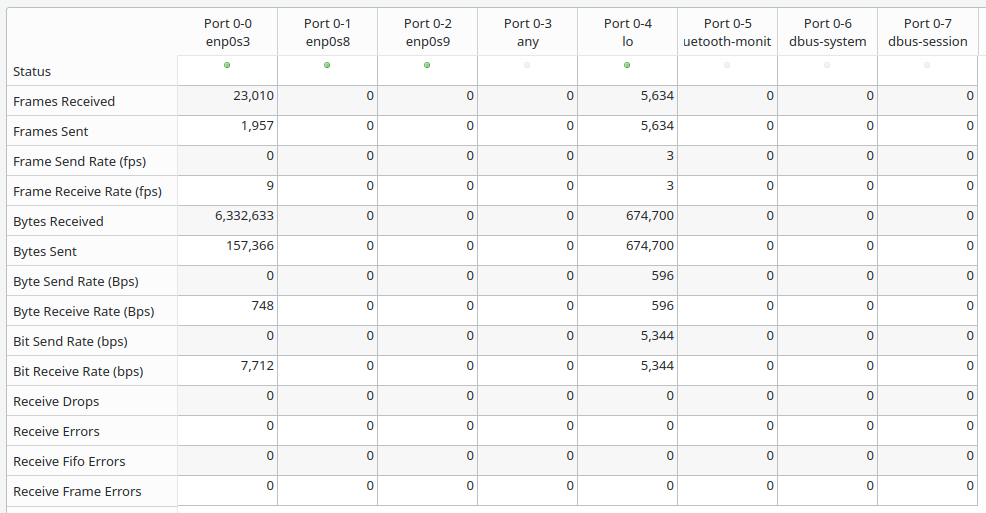
One of the main reasons users look at the port stats is to compare the Tx and Rx stats on 2 or more ports, so having them close to each other, I feel is better than grouping all Tx together followed by all Rx.
So, I started by fixing the order, so that send and receive for all stats are always consistent (it wasn’t already for some inexplicable reason) - send followed by receive. I also removed the Byte Send/Receive Rate stats as networking users deal in bitrates rather than byte-rates.
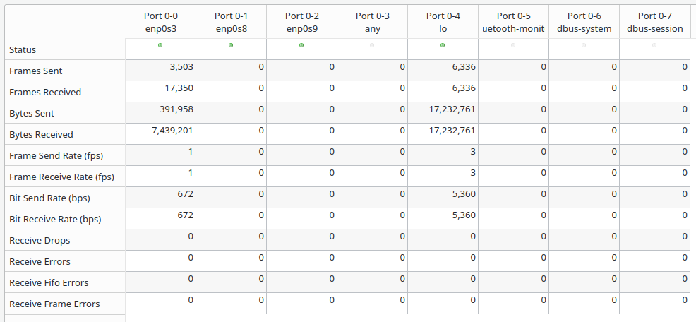
Next, I extended the alternate background color of the stats to the row headers as well for more of a visual cue.
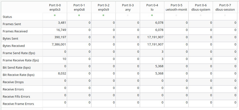
A nice side-effect of doing the above that emerges is that the send rows all have a gray background, while the receive rows (except the drop/error ones) all have a white background.
This alternate header row colors doesn’t work on Windows because, by default, Qt will use a platform native look and Windows doesn’t allow alternate background color of header rows. A workaround is to emulate the Windows style by starting Ostinato as ostinato -style windows
I then visually grouped the related stats using a horizontal line.
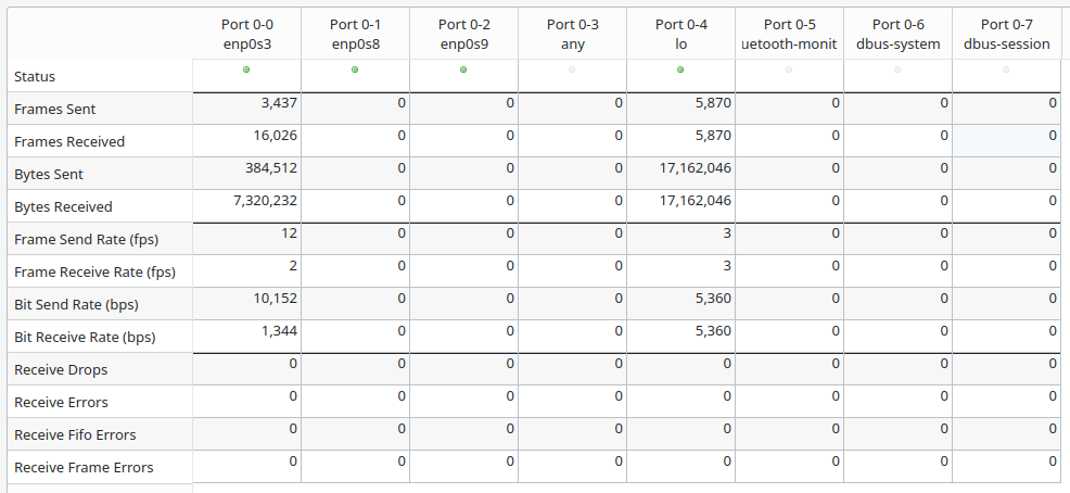
Extending the horizontal line to the row headers would be nice, but was too complicated to implement, so I let that slide.
Finally, I moved on to Ezra’s suggestion to rename the stats starting withTx/Rx.
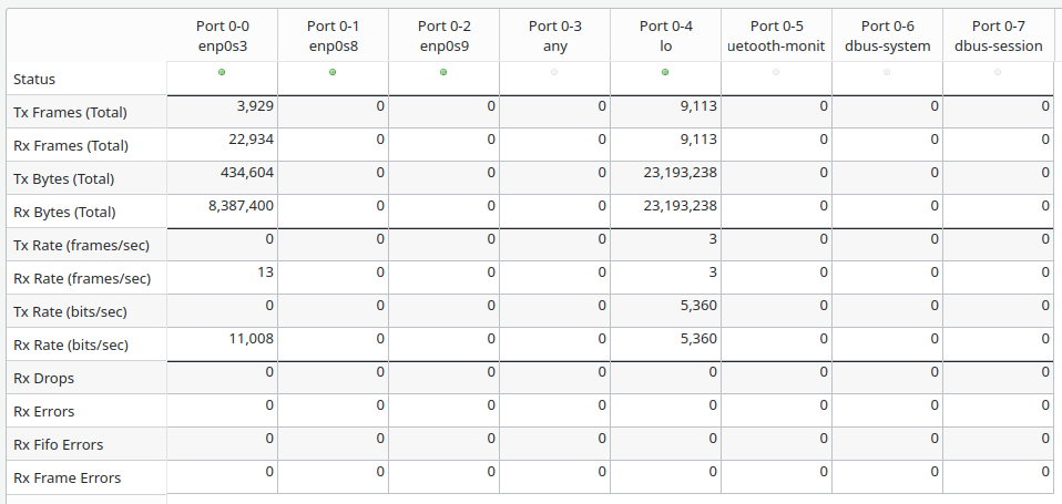
Using the Tx/Rx terminology instead of Send/Receive made the pair names the same length and differ only in one character - in my opinion this makes it difficult to quickly distinguish between them.
So I reverted the changes and retained the existing names, just rephrasing them so that they all start with Send or Receive.
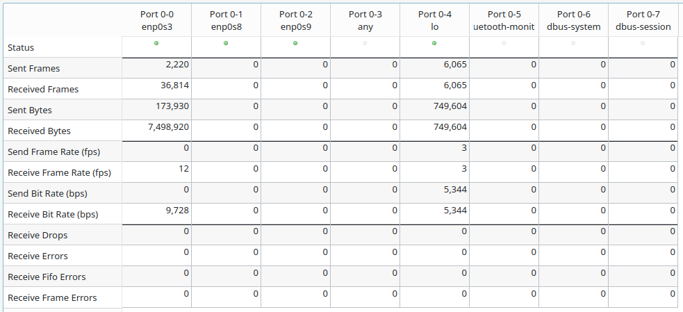
What do you think of these changes? Let me know in the comments below!
For more Ostinato related content, subscribe for email updates.

Leave a Comment