
Ostinato first run UX improvements
About a month ago, Ostinato user cube_030 provided the following suggestions as part of the Ostinato quick feedback survey
UI needs to be cleaned up some things should be automatic or more clear. One example is after loading a stream it needs to be applied. This was not clear at first.
Also some buttons are available even if they do nothing. i.e. when no interface is selected you can still hit play.
However this product has helped a lot and made testing a lab work much easier.
Around the same time I subscribed to Patrick McKenzie (patio11) and the first email/video in the series talked about improving the first run experience for users.
I’ve always known that the Ostinato UI is not intuitive for first timers - especially those who haven’t used commercial traffic generators. The split architecture and the notion of streams etc. are unfamiliar to them. But for the longest time I’ve been reluctant to simplify the interface hoping instead that a quickstart will be able to bridge the gap.
Watching Patrick’s video (available only to subscribers) convinced me that this was a missed opportunity. They will most likely open the UI, not know what to do, click a few things here and there, things won’t work and they will close the app in frustration regretting their decision to try it out.
So I decided to do something about it. Patrick recommends the first run of the app to start with a virtual tour of the interface and how to perform common tasks. I couldn’t figure out how to do this in Ostinato which is a Qt widgets based desktop app (modal dialogs with customized placement maybe?) - I decided not to spend too much time figuring this out, but see if there was some other way I could achieve the same objective.
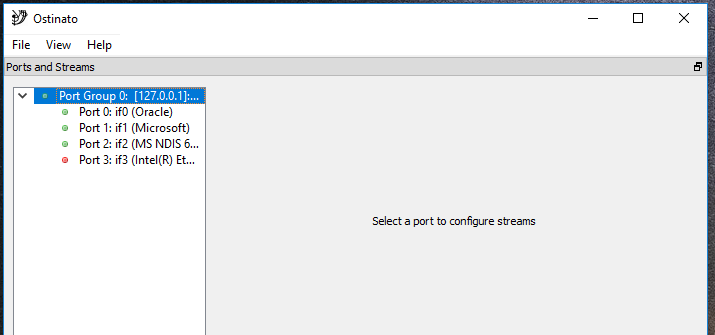
I started with the first screen that users see when they run the app and put myself in the shoes of a new user -
A new user’s reaction to that is likely to be -
What am I supposed to do here? How do I generate a packet?
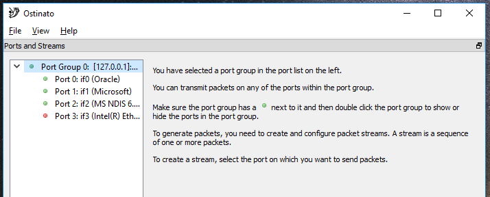
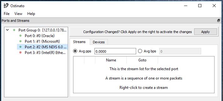
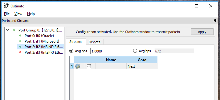
So, I wrote some helpful text utilizing the empty top right area. This area is used only when you select a port from the port list. However, when the app opens, nothing is selected in the port list, so it remains blank. A good space for basic instructions -
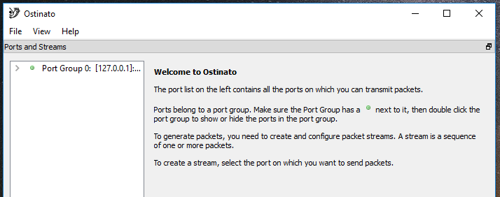
That’s better.
The challenge with writing instructional text is - you want it to be succint, not just because space is constrained and visually you don’t want it to be crowded, but because longer the text, less likely the user will read it. Writing the copy for this (and for subsequent textual hints) took me several iterations, tweaks and was quite time consuming, but I told myself - good copy takes time.
What would be even better was if the port group auto expanded to show all the ports instead of the user having to double-click the port group to reveal it (I remember wanting to do this when I first wrote this code but that didn’t happen for some reason - maybe ‘coz I was new to Qt and/or I had other important stuff to implement, so I probably didn’t spend much time on it). Anyway, I figured it out this time -
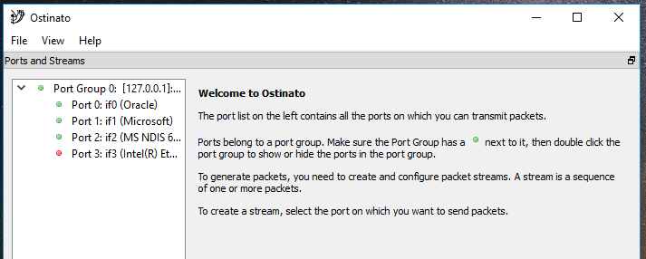
One problem I ran into was that once a port group or a port is selected in that list causing this welcome screen to be replaced, there’s no way to see it again. There will always be a current/selected item in that list. A bit of research and I found that this is a QTreeView bug/behaviour - so I wrote XTreeView to fix that.
But how would a user know that clicking on a blank area in the port list would bring back the welcome screen? Well, I don’t have an answer for that - I can just hope that if he clicks around, he will discover it :-)
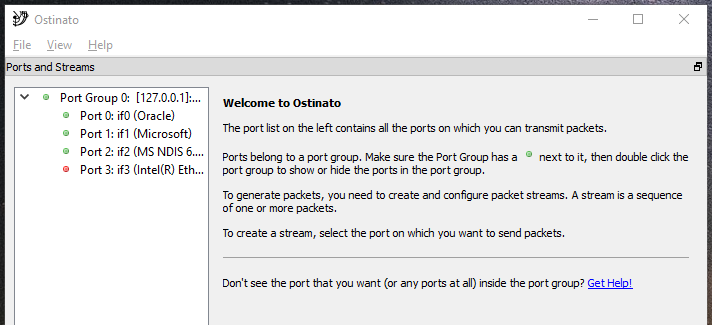
Another thing I wanted to tackle here was a common problem that users run into when they first run Ostinato - the port group is empty. I have a detailed entry in the FAQ on why this happens and how to fix this - but a first time user doesn’t know that!
So, I added some text to point to that.
The instructions on this welcome page asks the user to select the port and hopefully that’s what he would do, but what if selects a port group?
We can do better than that. Let’s reinforce the instructions by repeating them -
Now, let’s select a port.
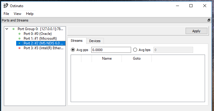
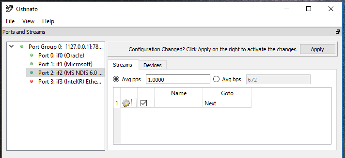
We run into a problem here. We no longer have a blank space but a widget here, so how do we write some instructions? I tried adding instructional text at the bottom of the stream list widget, but didn’t like that it took up valuable screen estate and reduced the size of the stream list widget. I tried adding the text next to the Apply button, which solved the screen estate problem, but wasn’t entirely satisfied with the results -
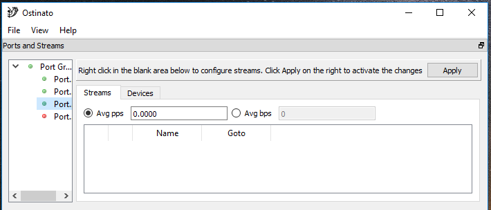
What if we could reuse the blank area of the stream list widget itself? We need the instructions only to add the first stream and hopefully user would remember those to add more streams.
So I wrote XTableView which displays some helpful text if the view has no items to be displayed. I utilized the area next to the Apply button to hint at when clicking Apply was required.
So the user right-clicks and selects New Stream from the context menu to create his first stream. Great!
What’s the next step? He needs to edit the just created stream because add just creates a default stream, not with the attributes that the user wants.
So what does the user have to do to edit the stream? Double click on the gear icon in the stream or right click the stream to access the context menu. Not very intuitive from the above screen. The user has had a glimpse of the context menu when adding a new stream, so he might have seen that it included an edit stream action also. Not something we can rely on.
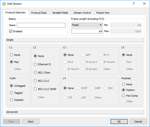
Hold on. Do we really need to have a 2 step new+edit action? What if we collapse it into a single action? i.e. new stream would directly open the stream configuration dialog (used to edit the stream)?
A good idea, but we need to also handle these cases -
- Include stream name and stream enable/disable in the dialog - the only way to edit these stream fields currently was directly from the stream list, not from the dialog
- Adding multiple new streams requires the ability for the dialog to support editing and traversing multiple streams including the ability to identify which stream he is editing
- Adding one or more streams and then pressing Cancel in the dialog should not incorrectly mark the port as dirty (more on this later)
Making these changes in the code required some refactoring and rework, but at last it was done -
Next step? Click Apply to push changes to the agent. A frequent stumbling block for new users who don’t realize that without doing that no packets will go out.
Ideally, we should auto apply any changes, but ‘coz applying changes is a sequence of synchronous RPCs, they sometimes take time and the UI is disabled for that duration. Which is a irritant if you have to create/edit multiple streams. So I had taken the original design decision to not do a auto apply and leave it to the user to decide when to apply.
There was also a matter of being able to detect all the changes made by the user to mark the port as dirty - not a straight forward task.
As with any hard task I had a lot of resistance to tackle this. But somehow this time I managed to overcome that and got down to the task of detecting all the changes that make a port dirty. In the end, it wasn’t as difficult as I thought it would be (note to self: everything is not as difficult as it appears to be).
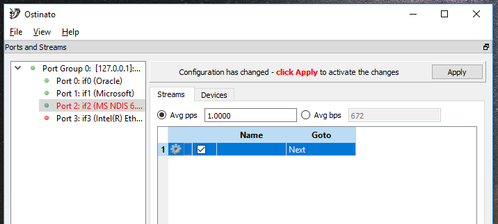
Once I was able to detect when a port was dirty and needed to be applied, I replaced the always on generic text I had added next to the Apply button to be intelligent. The text would appear only when a change made the port dirty. I also changed the color of port in the port list to red to signal to the user that something requires his attention.
To show that these are related, I used a bit of red in the apply text to match the port name.
Ok, user hits apply. Next step?
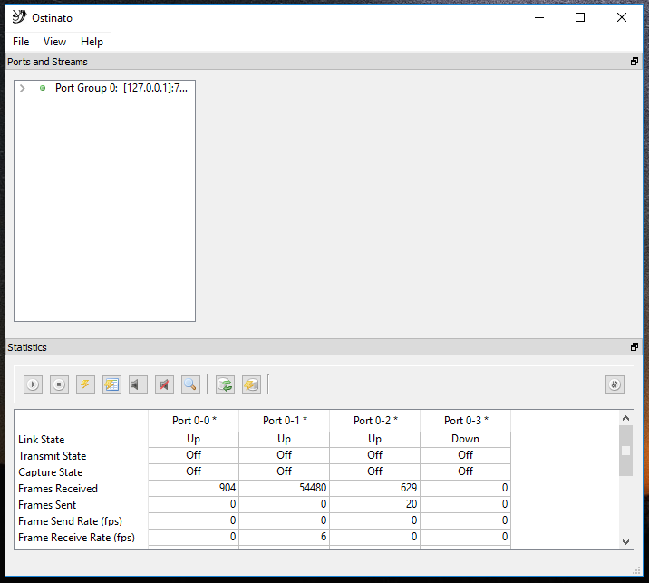
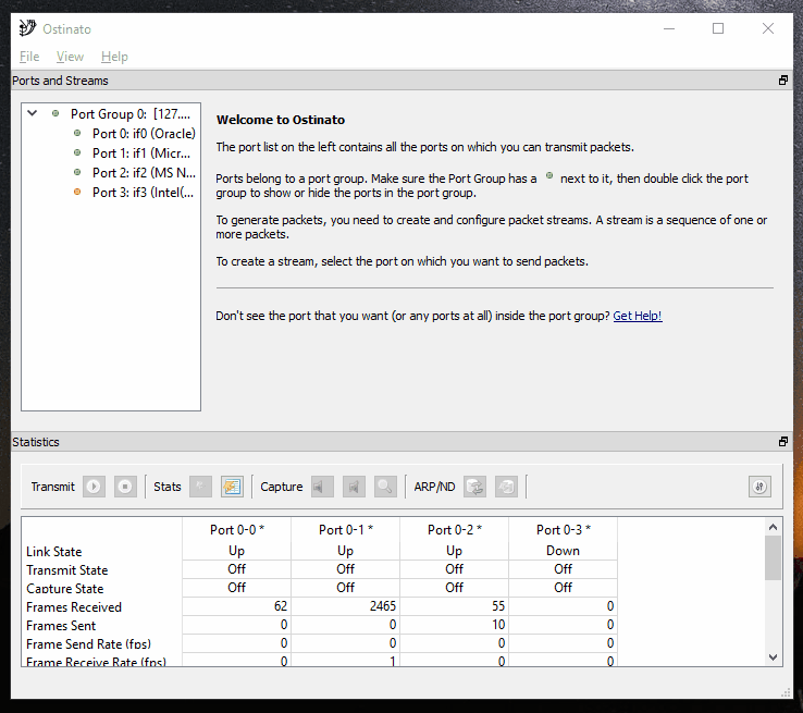
He needs to go over to the Port Statistics window for the next task - stream transmit. So once Apply is clicked, we change the Apply text to direct him there -
Trigerring stream transmit in the port statistics window is a multi-step process -
- Select the port(s)
- Click on the Start Transmit toolbar button
As cube_030 pointed out in his suggestions, ‘coz the toolbar buttons are always enabled, it is not clear that user first needs to select a port.
Also, because the buttons have only icons, no text, you don’t know which is the transmit button (they do have tooltips which appear when you hover over the button, but that’s not intuitive).
I tried adding text to all the buttons but they took up too much screen estate, so I added category labels instead.
For some reason that I don’t recall now, to select a port in this window, I require that the user select entire port column by clicking on the column header - selecting a few cells of the port wouldn’t suffice. The user guide even has a helpful image to warn about this. But a first time user doesn’t know that.
So, I changed the code to automatically select the entire column when you click anywhere in that column, not just the header. I also changed the code so that buttons are enabled only if one or more ports are selected -
The user can now click on the Transmit play button to start transmitting packets.
Here’s an animated walkthrough the new UX -
To be consistent, I also added similar hints as the stream list to the device list as well, although more needs to be done there. I’ve left that for a future release.
With these UX improvements, users will hopefully have a better first (and subsequent) run experience.
For good measure, I added/improved some error messages for frequent stumbling blocks that users face - that’s the next post though!
All these UX improvements will be part of 0.9 release which I’m currently working towards.
Leave a Comment